
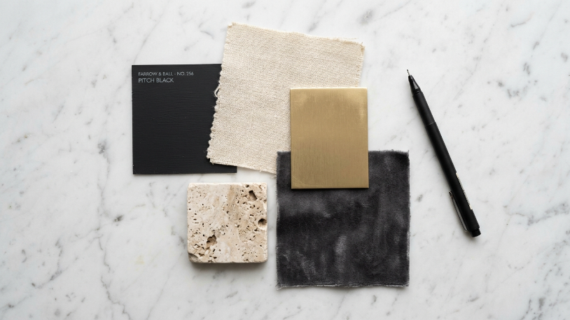
A black and gold room can go two ways. Done right, it looks rich, warm, and quietly confident. Done wrong, it looks like a Las Vegas hotel lobby that peaked in 1994. The key to style a black and gold room that actually works is knowing the order of decisions: color ratios first, big furniture second, then layers, lighting, and finishing accents. This guide walks you through every step in the right sequence so nothing gets out of hand.
What Makes a Black and Gold Room Work
Before you move a single piece of furniture or open a paint can, it helps to understand the rules this color pair plays by. Black is heavy. Gold is bright. Together, they need a neutral referee, strong structure, and careful restraint to land well. When those three things are in place, the result is a room that reads as intentional and grounded rather than loud or overdone.
The mistake most people make is treating this palette like a theme. Black and gold is not a theme. It is a color strategy. You build it piece by piece in a specific order, and you edit as you go. Skipping steps or rushing to the accessories before the foundation is solid is the fastest way to end up with a room that feels like too much.
Also, the finish of your materials matters here as much as the color itself. Matte black reads quieter and more modern than gloss black. Brushed gold feels softer and warmer than polished gold. Those differences shape the entire mood of the space before a single cushion is styled.
Step 1: Set Your Color Ratios Before You Shop
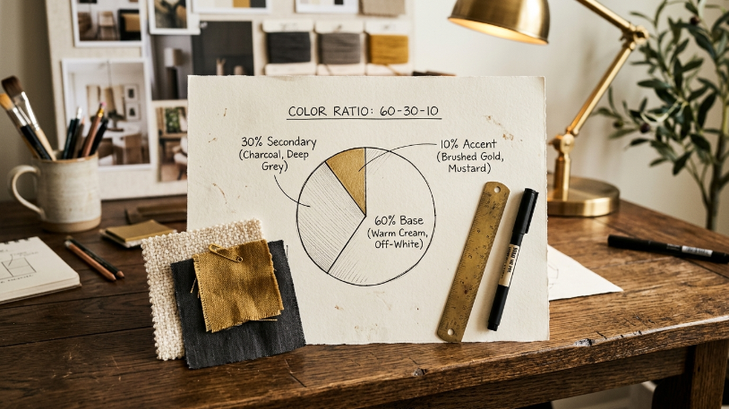
Your color ratio is the single most important decision you will make for a black and gold room. It controls whether the space feels rich or relentless. Set it before you buy anything.
Use the 60-30-10 rule as your starting point. Your dominant color (60%) should be a warm neutral: cream, warm white, linen, greige, or a light warm taupe. Black takes the secondary role at around 30%. Gold is your accent at roughly 10%. If gold creeps past 15% of the visual space, the room starts to feel like a crown instead of a home.
Want more drama? Push black up to 40% and tighten gold to 8%. Want a lighter, airier feel? Pull black back to 20% and let the warm neutral breathe. The neutral does the heavy lifting in terms of balance. Gold only needs to show up in four or five well-placed spots to do its job.
Write your percentages down. Pin them to a notes app or stick them in your wallet. Seriously. It is surprisingly easy to drift from your original plan once you start shopping. A black velvet sofa looks gorgeous in a showroom. In a small room with low ceilings, it can eat the space alive.
Quick ratio reference:
| Mood Goal | Neutral % | Black % | Gold % |
| Light and airy | 65 | 25 | 10 |
| Balanced and warm | 60 | 30 | 10 |
| Dramatic and moody | 50 | 40 | 10 |
| Bold and statement | 45 | 40 | 15 |
Step 2: Choose the Right Wall Color
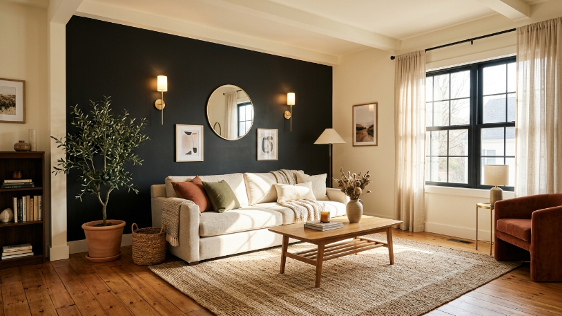
Your walls are the largest surface in the room, so this decision sets the backdrop for everything else. For a black and gold room, you have three strong directions and one direction to avoid.
Option 1: Warm white or cream. This is the most forgiving choice. It keeps the room feeling open and lets your black and gold pieces do the visual work. It also scales well in smaller rooms where too much dark wall color would close things in. Look for whites with a yellow or red undertone rather than a blue or green one. Sherwin-Williams has an excellent online color tool to compare undertones before you commit.
Option 2: Deep charcoal or matte black on one accent wall. One dark statement wall creates a natural focal point and makes gold accents glow against it. Keep the remaining three walls light, and let warm lighting do the rest. This works especially well behind a headboard or behind a fireplace mantle.
Option 3: Warm mid-tone neutral. Dusty mushroom, warm taupe, or a greige with red undertones is the quietest and often most sophisticated option. Gold reads beautifully against warm earthy walls. Black grounds it without competing.
The one to avoid: Cool gray. It reads bluish under warm light, which makes gold look brassy and cheap. The whole palette shifts in the wrong direction. Stick to warm undertones across the board, no matter which direction you choose.
Step 3: Anchor the Room with the Right Furniture
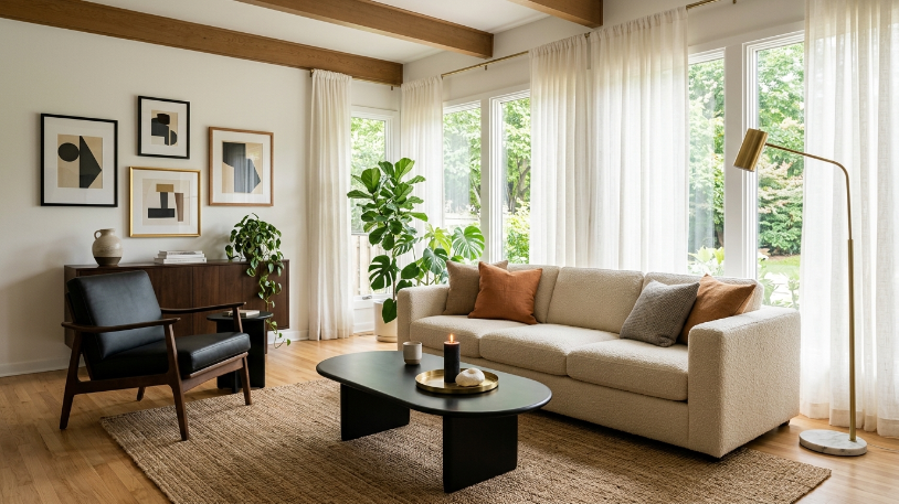
Anchor pieces are the large furniture items that define the room’s bones. In a black and gold room, these carry most of the visual weight. Choose them before you add any accents.
For your main sofa, a warm neutral fabric works better in most rooms than a fully black sofa. A solid black sofa reads as heavy unless you have strong natural light and high ceilings. Cream, oatmeal, dusty blush, or warm white upholstery gives the room somewhere to breathe. Save solid black for an accent chair, a dining table, a sideboard, or a bed frame.
Silhouette matters here. Clean lines with tapered legs, subtle curves, or simple geometric forms look more grounded than heavily carved, ornate pieces. Ornate furniture can work in a black and gold room, but only when the rest of the room is stripped back and quiet. Ornate plus busy equals chaos.
Anchor piece checklist:
- Main sofa: Warm neutral, velvet, linen, or boucle fabric
- Coffee table: Black lacquer, smoked glass with black legs, or travertine with gold hardware
- Dining table: Black base with gold detail, or natural wood with a matte black frame
- Bed frame: Matte black, or black with brushed gold hardware accents
- Storage pieces: Low-profile silhouettes in matte or satin finishes; avoid high-gloss on large pieces
- Area rug: Jute, wool, or a low-pile rug with a subtle pattern to ground the seating group
One firm rule: do not mix shiny black and matte black across your large pieces. Pick one finish and commit to it. Matte black is the more versatile choice and far easier to keep looking grounded.
How to Style a Black and Gold Room with the Right Materials
Once the big pieces are in place, materials become your main tool. Texture, finish, and surface quality are what separate a styled room from a decorated one. In a black and gold room, this layer does most of the heavy lifting.
Step 4: Bring Gold In at the Right Points
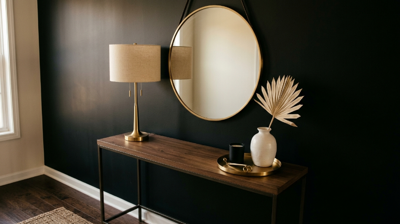
Gold is the accent in this color story. It works best in small, deliberate doses. Think of gold as punctuation, not the whole sentence. The goal is for it to catch the eye at specific moments across the room, not flood every surface.
The most effective places for gold:
- Light fixtures: pendants, chandeliers, floor lamps, sconces, and table lamps
- Hardware: drawer pulls, cabinet handles, curtain rods, faucet fixtures, and towel bars
- Frames: mirrors, art frames, and decorative shelf brackets
- Trays, vases, candleholders, and small decorative objects
- Furniture legs, bases, and accent details
When choosing your gold finish, pick one family and stay consistent. Brushed gold, also called satin brass, is warm and soft and the easiest to work with. Polished gold is shinier and more formal. Antique gold has a matte, aged quality. Mixing all three across one room makes the space feel unresolved.
Also, pay close attention to undertone. True warm gold pairs beautifully with cream and warm white walls. Champagne gold, which skews lighter and slightly cooler, can clash with warm-toned paint if you are not careful. The easiest test: bring a swatch of your wall color to the store and hold it next to the gold piece under lighting similar to your room. Your eyes will tell you immediately.
Step 5: Layer in Texture to Keep the Room Grounded

This is where most black and gold rooms fall short. Without texture, the palette reads flat and cold. Texture is what makes a room feel warm and lived-in. It also stops gold from looking harsh against dark surfaces.
The Pantone Color Institute notes that texture perception directly changes how we experience color in interior settings. When you add matte, rough, and natural textures alongside smooth, shiny ones, the warm tones in your palette deepen and soften at the same time.
Texture options that work well in a black and gold room:
- Velvet: on cushions, an accent chair, or a headboard panel
- Boucle or linen: on the main sofa or armchairs
- Jute or wool: as the area rug for natural warmth underfoot
- Marble or travertine: on a coffee table, side table, or bathroom countertop
- Rattan or cane: on an accent chair, a side table, or decorative baskets
- Brushed metal: on hardware and light fixtures throughout
- Matte ceramic or terracotta: for vases, pots, and decorative objects
Aim for at least three different textures in any given seating group. A boucle sofa with velvet cushions, a jute rug underneath, and a marble tray on the coffee table already gives you four distinct surfaces. That combination reads as rich without looking overdone.
Also, balance shiny with matte. If your coffee table is gloss black, your lamp is polished gold, and your mirror is chrome, the room will feel like a showroom. Every shiny surface needs at least one matte or natural texture nearby to settle it down.
Do and Don’t Reference Table
| Element | Do | Don’t |
| Wall color undertone | Warm: cream, greige, taupe | Cool: gray, blue-gray, lavender |
| Sofa color | Warm neutral, dusty blush, or oatmeal | All-black in small or low-light rooms |
| Gold finish | Pick one: brushed, polished, or antique | Mix all three finishes across the room |
| Rug texture | Jute, wool, low-pile natural weave | Shiny metallic rug (glare overload) |
| Light bulbs | 2700K-3000K warm white | 4000K+ cool white (kills the warmth) |
| Art frames | Matte black or brushed gold, consistent | Chunky ornate frames in a busy room |
| Surface styling | Sparse, intentional groupings of 3 | Covering every surface with objects |
| Plants | Dark-leafed varieties in simple planters | Fake plants in visible focal spots |
Finishing Your Black and Gold Room
The last three steps are about lighting, accents, and final edits. This is where the room either comes together or falls apart. Take your time here. Most styling mistakes happen in the final layer.
Step 6: Plan Your Lighting in Three Layers
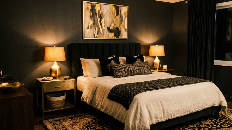
Lighting can make or break a black and gold room. Gold finishes go flat under cool white light. Black walls lose all depth under the wrong bulb. Get the lighting right and the whole palette wakes up.
Always use warm-toned bulbs. Look for bulbs in the 2700K to 3000K range on the Kelvin scale. Anything above 3500K begins to push blue, which makes gold look brassy and walls look cold. The Energy Star labeling program requires bulb packaging to display the Kelvin temperature clearly, so it is easy to check before you buy. Source: Energy Star Lighting.
Layer your fixtures across three levels:
- Ambient: An overhead pendant, chandelier, or flush mount in a brushed gold or matte black finish for general room light
- Task: A table lamp or floor lamp in brushed gold or matte black near a reading chair or desk
- Accent: Wall sconces beside art or a mirror, picture lights, or warm LED strip lighting behind a shelf or panel
Avoid using recessed lighting as your only source. It creates a flat, overhead wash that flattens every surface and kills the warmth of gold accents. Warm sconces and table lamps add side-light and shadow, which gives the room dimension and makes gold glow softly in the evening.
Step 7: Style Your Surfaces and Finishing Accents
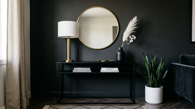
This is the final layer, and it is where the room finds its personality. Surface styling pulls everything together. Done well, it feels curated and intentional. Done poorly, it reads as clutter with good taste in colors.
In a black and gold room, keep your surface styling spare. Fewer objects, more space between them. Busyness in this palette reads as overwhelming rather than rich. The darker your room, the more restraint you need on surfaces.
On a coffee table, a brushed gold tray holding one black candle, one small sculpture, and a single fresh stem is already complete. You do not need more. On a console table, a large mirror, one lamp, and two objects of varying height form a finished vignette. Resist the urge to fill every gap.
Art that works well in a black and gold room:
- Abstract line art or gestural painting in matte black frames with cream or gold matting
- Botanical prints or architectural drawings in consistent black frames
- A large-format black and white photograph as a single statement piece
- One bold piece with an accent color (forest green, terracotta, rust, or deep navy) to break the monochrome and add warmth
Plants also earn their place in a black and gold room. A dark-leafed variety like a snake plant, ZZ plant, or fiddle leaf fig adds life without pulling focus from the palette. Use a simple white or matte black planter to keep the look cohesive. Skip ornate pots with pattern or color unless you are very sure they fit the scheme.
Step 8: Edit and Balance Before You Call It Done
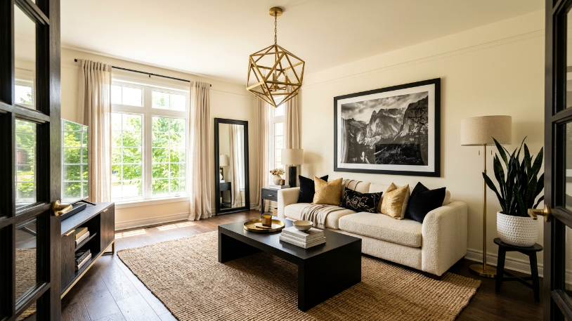
Walk into the finished room and squint. Yes, actually squint. This blurs the details and lets you read the room as a whole, which makes imbalances easier to spot. If one corner feels dramatically heavier or brighter than the rest, something needs to move.
Check for these common imbalances:
- Black is clustered on one side of the room. Redistribute a cushion, frame, or object to the other side.
- Gold appears only in one spot. Spread it to at least three visual points across the room: one lamp, one piece of hardware, and one decorative object is a good minimum.
- Surfaces feel crowded. Remove one or two objects from a styled vignette and see if the room immediately relaxes. It usually does.
- Everything feels fabric-heavy. Add a natural, stone, or ceramic element to break up the softness and give the eye somewhere firm to rest.
- The room reads too dark overall. Swap one solid black cushion for a cream one, or add a lighter-toned throw blanket. Small shifts move the balance noticeably.
Also revisit your Step 1 ratios. Hold up a photo of the finished room on your phone and compare it to the percentages you wrote down. Black has a tendency to creep past 40% once you add cushions, frames, art, and furniture together. If the room feels heavy, it is almost always the black ratio quietly getting out of hand.
A well-styled black and gold room looks like someone made specific, deliberate choices and then had the discipline to stop. That restraint is what separates a grounded space from an overwhelming one.
Final Thoughts
Styling a black and gold room takes patience and a willingness to edit. The palette rewards restraint more than most. When you get the ratios right, choose warm materials, keep gold deliberate, and layer texture throughout, the result is a space that feels confident and grounded rather than loud or overdone. Start with your color percentages, build your foundation, and trust the process. The room comes together more quickly than you expect once the order is right.
Good luck, and enjoy the process. A black and gold room is one of the most satisfying to put together, especially once you stop second-guessing the cream sofa.