
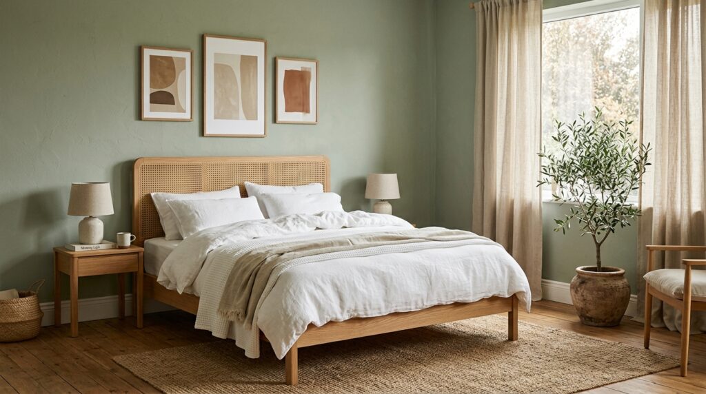
Sage green is the color that does not try too hard. It sits quietly on the wall, makes your bedding look better, and somehow makes you sleep more deeply. Or at least it feels that way. There is a reason designers keep reaching for it, and it is not because the paint cans look pretty on the shelf (though they do).
This guide will walk you through every step of building a sage green bedroom from scratch. You will not need a design degree, a fat budget, or a Pinterest board with five hundred pins. You will need a clear plan, a few smart picks, and the patience to do it in the right order. We will go shade by shade, layer by layer, and piece by piece. By the end, you will have a bedroom that feels like a deep breath at the end of a long day.
Let us get into it.
Why Sage Green Works So Well in a Bedroom
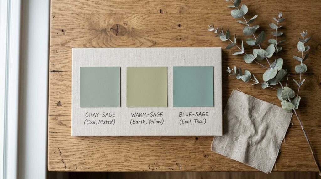
Before you pick up a paint brush, it helps to know why this color works at all. Sage green is a muted green with a soft gray base. It does not shout. It does not buzz. It sits in the middle of the color wheel, which means it plays nicely with almost every other shade. Warm whites, soft creams, dusty pinks, deep browns, even black. They all look good next to sage.
The color is also tied to nature. Think dried herbs, eucalyptus leaves, and the underside of olive trees. Our brains link it to the outdoors, and the outdoors helps us calm down. That is why sage green is often picked for spaces where rest matters most, like bedrooms, reading nooks, and quiet corners.
There is also the practical side. Sage green is forgiving. It hides small marks and fingerprints better than crisp white. It does not feel cold like a stark gray. It does not feel busy like bright blue. It just sits there and does its job, which is exactly what you want from a bedroom wall.
And no, sage green is not a passing trend. It has been showing up in homes for decades, from English cottages to mid-century lofts. It just keeps coming back, because it keeps working. (The same cannot be said for shag carpet, but we will not bring that up.)
Picking Your Perfect Shade of Sage Green
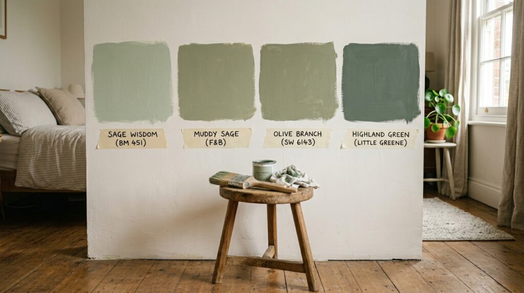
Here is where most people get tripped up. Sage green is not one color. It is a whole family of colors, and the wrong pick can turn your dream bedroom into a hospital waiting room. So slow down and pay attention to this part.
Start by looking at the natural light in your bedroom. If your room faces north, the light will be cool and a bit blue. A cool sage will look gray and washed out in that light, so go for a warmer sage with yellow or earthy undertones. If your room faces south or west, you get warm, golden light most of the day. In that case, a cooler sage will balance things out and keep the room from looking too yellow.
Next, think about the size of your room. In a small bedroom, a deep sage green can feel cozy and rich, almost like being wrapped in a soft blanket. In a large bedroom, you can go either light or deep, but a medium sage tends to work best because it grounds the space without swallowing it. If you have low ceilings, paint the walls sage and keep the ceiling bright white. The contrast will trick the eye into seeing more height.
Buy sample pots. This is not optional. Paint a big square (at least two feet by two feet) on more than one wall, and look at it across the day. Morning light, afternoon light, lamp light at night. A color that looks perfect at noon can look swampy at 9 p.m. Some popular sage shades worth testing are Farrow and Ball’s Card Room Green, Benjamin Moore’s Saybrook Sage, Sherwin Williams’s Evergreen Fog, and Behr’s Jojoba. They each have a different mood, so pick the one that feels right for your space.
Planning the Layout and Painting the Walls
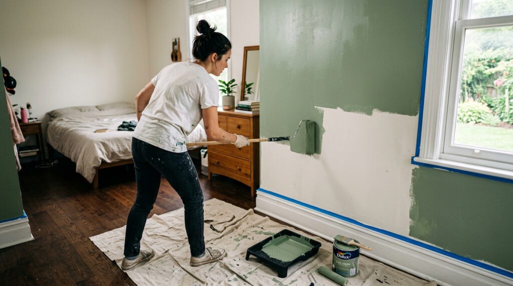
Now that you have your shade picked, do not start painting yet. First, plan the layout of your room. The placement of your bed, dresser, and reading chair will affect which walls grab the most attention. The wall behind the headboard is your hero wall, the one your eye lands on first when you walk in. That wall earns the boldest color.
You have a few painting choices. You can paint all four walls sage green for a fully wrapped feel. This works best with light bedding and pale floors, otherwise the room can feel heavy. You can paint just the headboard wall and leave the others a warm white, which is great if you want a clear focal point without too much color. Or you can try the half-wall trick, where the bottom two thirds is sage green and the top is white or cream. This gives the room a soft, layered look and works well in older homes with charm to spare.
Before painting, clean the walls and patch any holes. Use a primer if your current wall color is dark or if you are painting over glossy paint. Two coats of sage green is the standard, but check your paint can. Some richer shades need three. Use a roller for the big areas and a small brush for the edges. Cut in around the ceiling and the trim with care, because messy lines will haunt you every morning when you open your eyes.
If painting feels like too much work, you have options. Sage green peel-and-stick wallpaper has come a long way, and some of it looks shockingly like the real thing. Botanical prints, soft stripes, and small leaf patterns in sage tones can give you the same feel without the drop cloth.
Choosing Bedding and Soft Textiles
Once the walls are dry, the bedding becomes the next big move. This is where the room either comes alive or falls flat. The trick with a sage green bedroom is to use bedding that softens the green without fighting it.
The safest and most beautiful pick is white linen bedding. Linen has a wrinkled, lived-in look that pairs perfectly with the soft tone of sage walls. The natural texture catches light in a way that makes the room feel layered and warm. Cream or oatmeal linen also works, and it leans into the earthy mood even more. If you want something with a bit of contrast, try a soft terracotta or warm rust as a throw blanket. These warm tones make the green pop without clashing.
Layering is what takes bedding from fine to beautiful. Start with a fitted sheet, then a flat sheet (yes, even if you do not use it, it adds depth when folded down), then a duvet or quilt, and finish with a throw at the foot of the bed. Pillows go in stages too. Sleeping pillows in the back, larger Euro shams in front of those, then standard shams, and finally one or two small accent pillows. Mix textures. A nubby boucle pillow next to a smooth linen one looks intentional. Two matching pillows can look stiff, like the bed is waiting for a magazine photo shoot that never came.
For colors in your pillows and throws, stick to a small palette. Warm white, soft cream, dusty rust, faded mustard, and natural brown all work. Avoid hot pink, bright orange, or anything that screams. Sage green prefers polite roommates.
Picking Furniture That Fits the Look
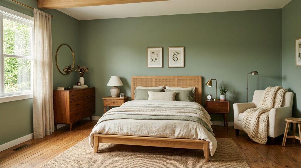
Furniture is where you can take the sage green bedroom in different directions. Want a warm, cottage feel? Go with light oak, pine, or cane. Want a more modern, soft look? Try walnut or black wood with clean lines. Want a vintage vibe? Hunt for old dressers with brass pulls and curved edges. Sage green is patient with all of these.
The bed frame matters most. A low wooden platform bed gives a calm, grounded look. A cane or rattan headboard adds texture and a touch of warm beach-house energy. An upholstered headboard in cream or oatmeal linen adds softness and works well if your walls are a deeper sage. Skip dark, heavy, four-poster beds unless your ceilings are tall, because they can swallow the calm mood you are building.
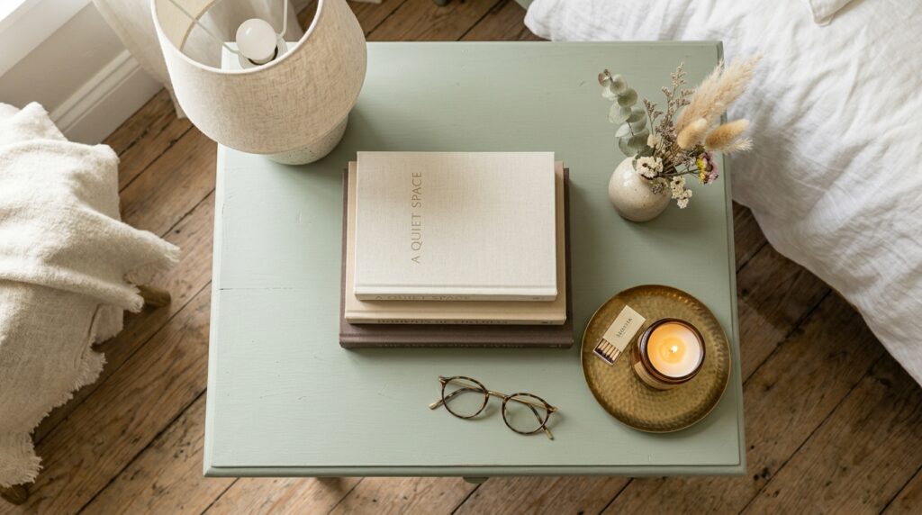
Your nightstands do not need to match. In fact, mismatched nightstands often look better, as long as they share a similar height and tone. One could be a small vintage wood table, the other a simple modern piece. Keep the surfaces simple. A lamp, a small stack of books, a tiny vase, and you are done. If you cannot resist piling things on, at least keep a tray underneath to catch the mess and make it look planned.
A dresser in natural wood balances the green walls and adds storage. If you have the space, a small reading chair in cream or beige creates a cozy corner. Toss a sheepskin or a knit throw over the back, and you have a spot that will pull you in every evening. A simple wooden bench at the foot of the bed is a nice extra if your room can take it.
One small joke for free: a bedroom is not a Tetris board. Leave breathing room around your furniture. Empty space is part of the design, not a sign that you ran out of stuff to buy.
Lighting, Window Treatments, and Rugs
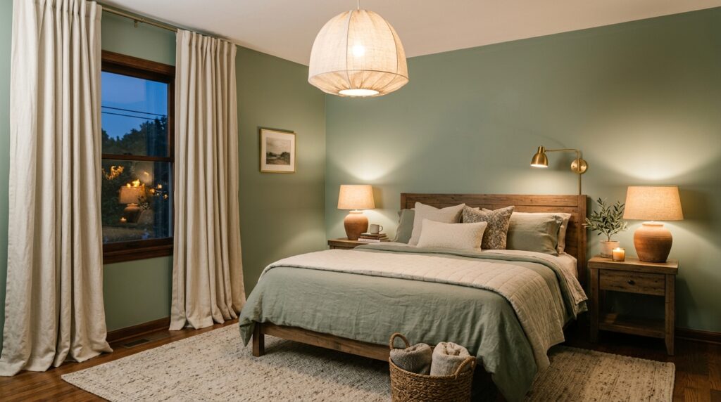
Lighting is the most underrated part of any bedroom, and in a sage green room it matters even more. Green walls drink up cool, harsh light and can start to look gray and dull. Warm light, on the other hand, makes the color glow. So aim for warm white bulbs, around 2700K, in every light source you can. Stay away from cool daylight bulbs. They will make your beautiful sage walls look like an office break room.
Use three layers of light. Overhead light from a soft fixture or pendant for general brightness. Bedside lamps for reading and softer evening light. And a small accent light, like a dimmer table lamp on a dresser or a small wall sconce, for mood. A dimmer switch on your main light is one of the best small upgrades you can make. The room becomes a different place at low light.
For window treatments, keep them soft and simple. Long, flowing linen curtains in cream, white, or oatmeal are the easiest match for sage walls. Hang the rod high, almost to the ceiling, and let the curtains kiss the floor. This makes the room feel taller and more polished. Avoid heavy patterned curtains with bold colors. They fight the calm mood. If you need light control, layer sheer curtains with simple blinds behind them.
Rugs are the last big piece. A large rug under the bed grounds the room and adds warmth underfoot. Natural fiber rugs like jute, sisal, or wool in cream, beige, or oatmeal work beautifully with sage walls. If you want pattern, a faded vintage style rug in muted greens, browns, and creams adds character without being loud. Make sure the rug is big enough. A common mistake is a rug too small for the bed. The front legs of the bed should sit on the rug at the very least. A bigger rug always looks better than a smaller one.
Wall Art, Mirrors, and Decor Touches
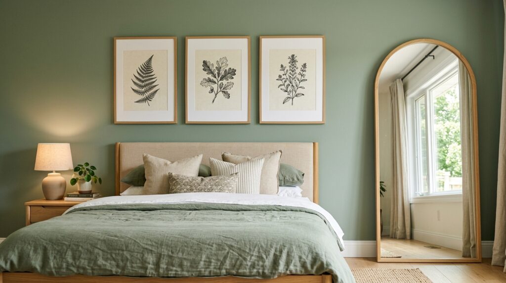
The walls above and around the bed should feel intentional, not random. The space above the headboard is the most important. You have a few ways to fill it. One large piece of art that stretches almost the width of the bed gives a clean, calm look. A pair of matching framed prints can work too, hung side by side. A gallery wall of three to five smaller pieces in similar frames adds more interest but takes more planning. Whatever you pick, keep the colors soft and earthy. Botanical sketches, abstract landscapes in muted tones, or vintage prints in cream and brown all look right at home next to sage green.
Frames matter. Light wood frames blend in and feel soft. Black frames give a more graphic, modern feel. Brass or antique gold frames lean traditional and warm. Avoid loud colored frames or anything too shiny. The art should feel like part of the wall, not a fight with it.
Mirrors are a quiet hero in a small bedroom. A large mirror, leaned against the wall or hung in a long shape, bounces light around the room and makes the space feel bigger. An arched mirror is a softer option that adds a hint of vintage charm. Place a mirror across from a window if you can, so it can catch and spread the daylight.
Other small touches make a big difference. A vase with dried branches on the dresser. A stack of books on the bedside table with a small ceramic dish on top for jewelry. A woven basket in the corner for extra blankets. A tray on the bench at the foot of the bed with a candle and a small plant. None of these things are big purchases, but together they tell the room you actually live there. They turn a styled space into a real one.
Plants and Natural Elements
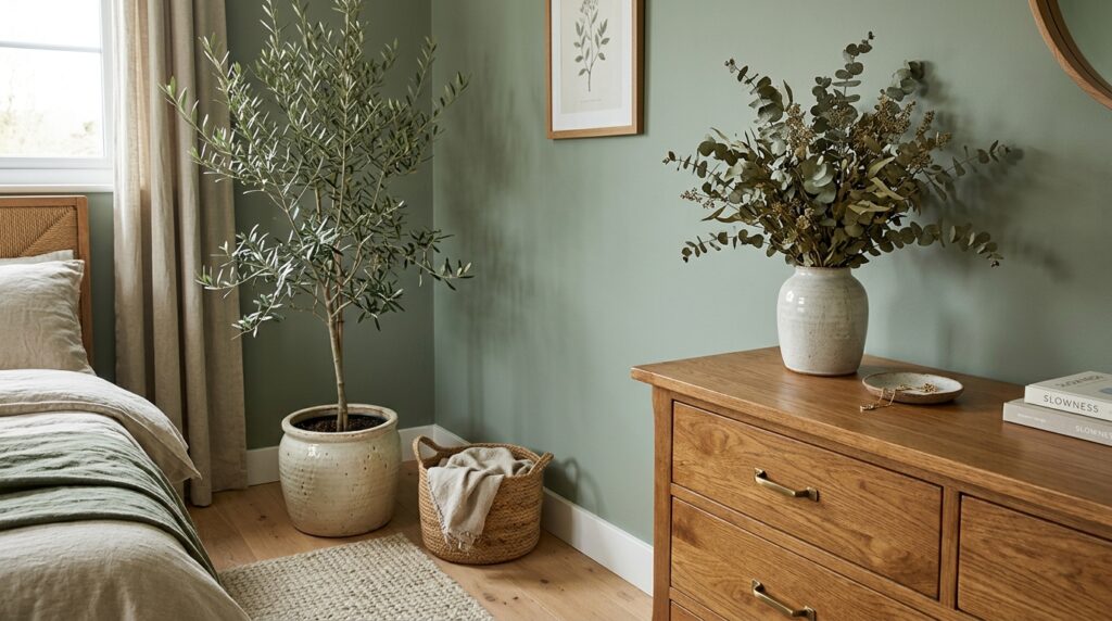
A sage green bedroom is already pulling from nature, so adding real plants pushes the feeling even further. The key is to pick a few good plants instead of filling the room with twenty small ones. Less can be more.
A tall plant in the corner makes a big impact. An olive tree, a fiddle leaf fig, or a snake plant in a clay or stoneware pot brings height and a soft visual anchor. On the dresser, a small trailing plant like a pothos or a string of pearls adds movement. On the bedside table, a tiny plant in a ceramic pot is enough. If you do not trust yourself with real plants (no shame in that, plants have feelings and bedrooms can be dark), high-quality fake plants have come a long way. Look for ones with matte leaves and visible texture. The shiny ones still look like they were made in 1998.
Dried plants are a great middle ground. Dried eucalyptus, pampas grass, or wheat in a tall vase looks soft and earthy and lasts for years. Pair them with a textured ceramic vase in cream, brown, or stone for the best effect. Keep the styling simple. A vase with three or four stems looks better than one packed with twenty.
Beyond plants, bring in other natural materials. A woven jute basket, a rough ceramic bowl, a piece of driftwood on a shelf, a wool throw, a leather strap on a bench. These materials add warmth and texture, which softens the room and keeps it from feeling flat. Natural things have small flaws and uneven surfaces, and those flaws are exactly what makes a room feel lived in and loved.
Final Styling Tips and Common Mistakes to Avoid
You have the bones of the room. Now it is time for the finishing layer, the part that makes the difference between a nice bedroom and a beautiful one. A few small things go a long way.
Always use the rule of three. When you style a surface, group items in threes. A lamp, a small stack of books, and a tiny vase. Or a candle, a tray, and a piece of pottery. Threes feel balanced to the eye without looking stiff. Vary the heights too. One tall, one medium, one short.
Pay attention to scent and sound. A small linen spray with lavender, a candle in earthy notes like cedar or sandalwood, soft music or a quiet playlist in the background. These small touches make the room feel complete in a way you cannot see in a photo but you feel the moment you walk in.
Keep cords hidden. Run lamp cords behind furniture, use a small cord clip, or pick wireless lamps if you can. Nothing breaks the calm of a sage green bedroom faster than a tangle of black cords by the bed. Same goes for chargers, remotes, and the random pile of stuff that ends up on the nightstand. Use a small tray or a drawer to keep things tucked away.
Now the common mistakes to skip. Do not use too many shades of green in one room. One main sage on the walls and maybe a hint of green in a plant or pillow is plenty. More than that and the room starts to feel like a forest theme park. Do not pair sage with cool grays. They fight each other and make the room feel cold. Warm neutrals are your friends. Do not overdo the brass. A little is great, too much and the room feels like a brass band. And please, do not match every piece of wood furniture. Mixed wood tones look richer and more collected.
One last note. Take your time. A bedroom is not built in a weekend. It is built over months, with small finds and patient choices. The best rooms always look like they were collected, not bought.
Bringing It All Together
A sage green bedroom is one of the easiest ways to build a space that feels calm without being boring. The color does most of the heavy lifting, so your job is to keep things simple and let it breathe. Start with the right shade, layer in soft bedding, pick warm wood furniture, add gentle light, hang a few good pieces of art, bring in plants, and finish with the small touches that make a house feel like home.
You do not need to do it all at once. Paint the walls this month. Find the bedding next month. Hunt for the right dresser when the right one shows up. The rooms that feel the best are the ones that grow slowly, piece by piece, until one day you walk in and realize it is exactly what you wanted.
Sage green has earned its place in bedrooms because it works. It is calm, friendly, warm, and forgiving. It is the color that makes you want to climb into bed earlier and stay there a little longer. And if a paint color can do that, it is worth every brush stroke.
Sweet dreams, and good styling.